HYDRO
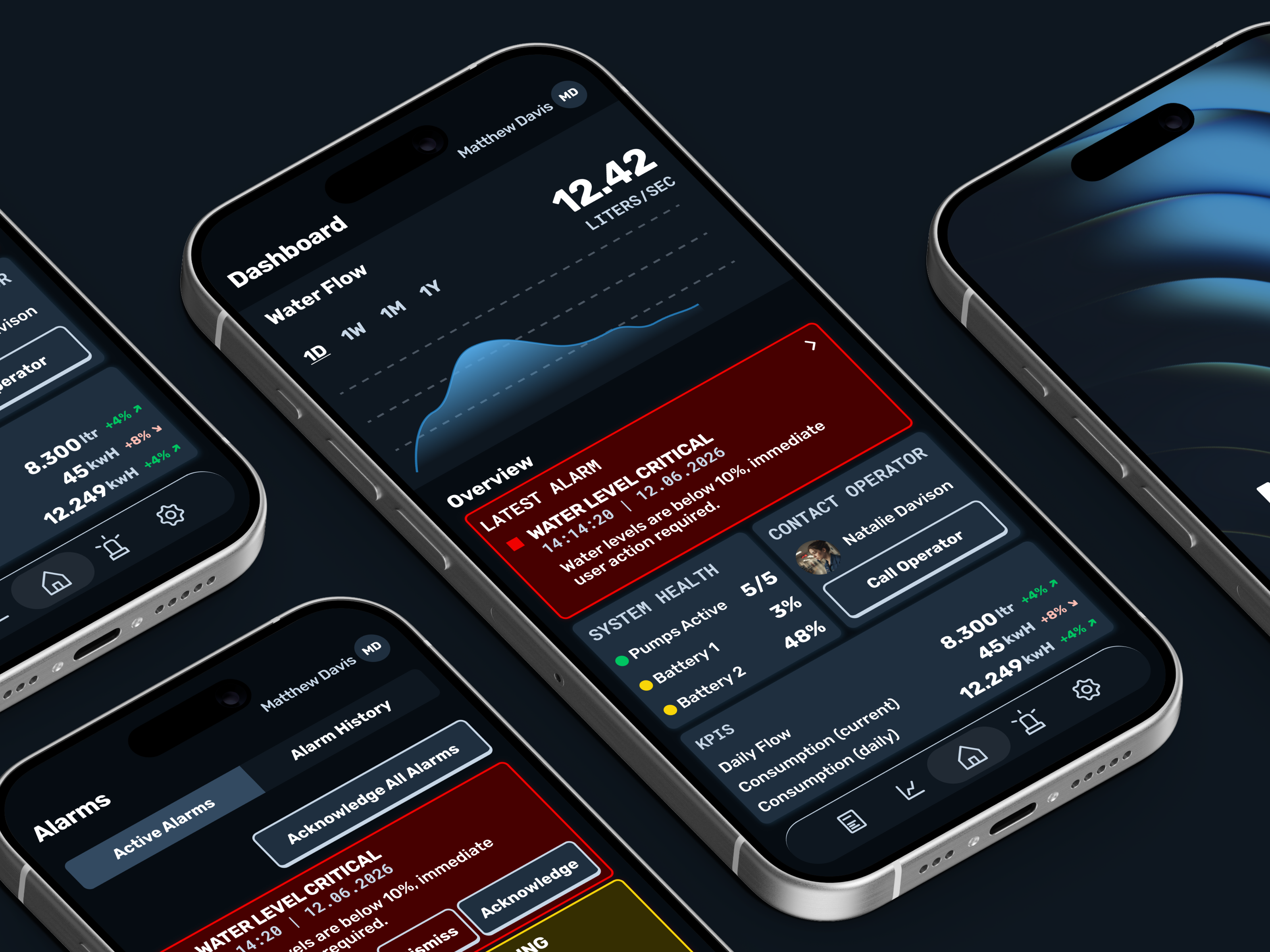
HYDRO is a conceptual industrial-grade, SCADA mobile app that allows users to manage and control complex water utility infrastructure in real-time.
Overview
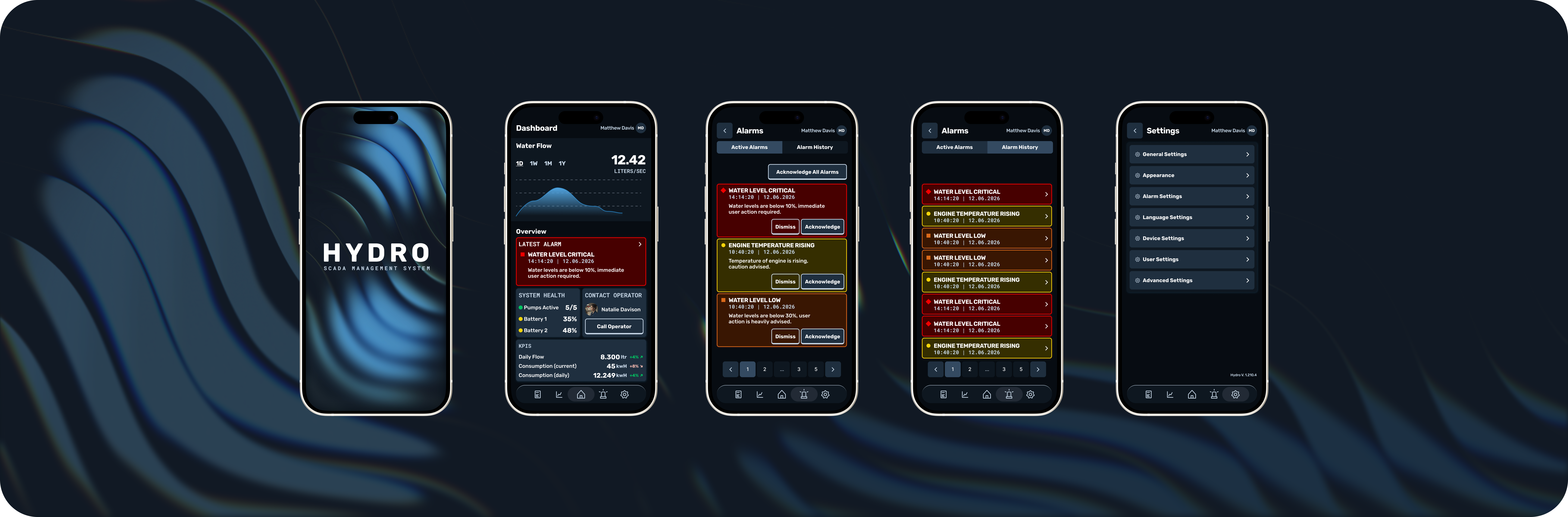
Due to NDAs, I'm often only allowed to show glimpses of my work, so for HYDRO, a conceptual dashboard, I took many lessons in UI/UX design I learned and applied them in a more liberated way.
Thought process & wireframes
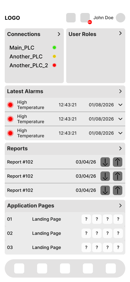
As with most projects, I usually start with quick, low-fidelity wireframes that outline the basic structure of how the product will work, things like which functionalities will need to be developed (alarm handling, pagination, notifications, etc.). This gives me a solid first estimate of the project's complexity, and cost, which I then share with the client. This part of the project is very UX-heavy: flows get defined, tested, and revised. This naturally continues into later stages too, but in my experience, this early groundwork saves a lot of time and budget down the line. From there, stakeholders take the wireframes and estimates to work out their budget and timeline, staying in close communication with me to confirm feasibility.
The design work
After the milestones and individual features are clear and agreed on by all parties, I start the actual UI work. Existing branding is used to define a full design system: primitive tokens, semantic tokens, components, the whole atomic-thinking mindset, shebang. This makes later changes very easy to roll out across the entire project without slowing down other parts of the work.
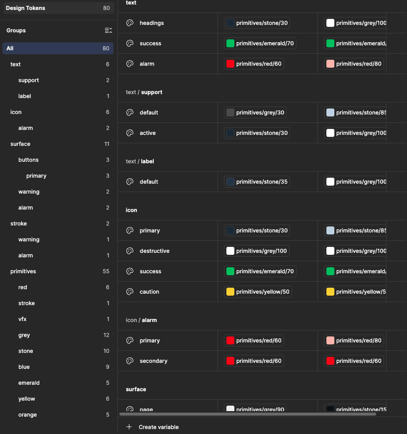
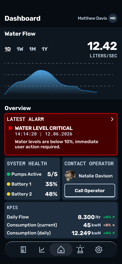
After the design system is ready, higher-fidelity screens get created. This is the UI-focused part of the project, with UX methodology underpinning every decision, from layout hierarchy to interaction patterns. Each screen is reviewed against the original wireframes and user flows to make sure nothing gets lost in translation as fidelity increases.
Outcome & Impact
The final designs demonstrate a complete design process, from early wireframes through a full design system to high-fidelity, production-ready screens, without the usual constraints of budget, timeline, or scope creep. Working through a project of this complexity end-to-end sharpened my ability to think in systems rather than screens, and reinforced how much of good SCADA/industrial UI design comes down to clarity under pressure: making critical information legible and actionable in situations where mistakes have real consequences.